Redesigning Ecosystem
Hyland
CHALLENGE
Through a series of acquisitions, Hyland had multiple SaaS products with unique websites. It was time to combine them all under one Hyland brand.
Additionally, the existing Hyland.com and customer hub experiences were fractured, overly complicated and frustrating for not only potential buyers but also existing customers. Users abandoned their tasks when they hit dead ends, inundating customer service teams with multiple requests. Potential customers couldn’t find the content they needed to make purchasing decisions.
We needed to determine how to simplify the customer journey and increase conversions under one unified Hyland brand experience.
SOLUTION
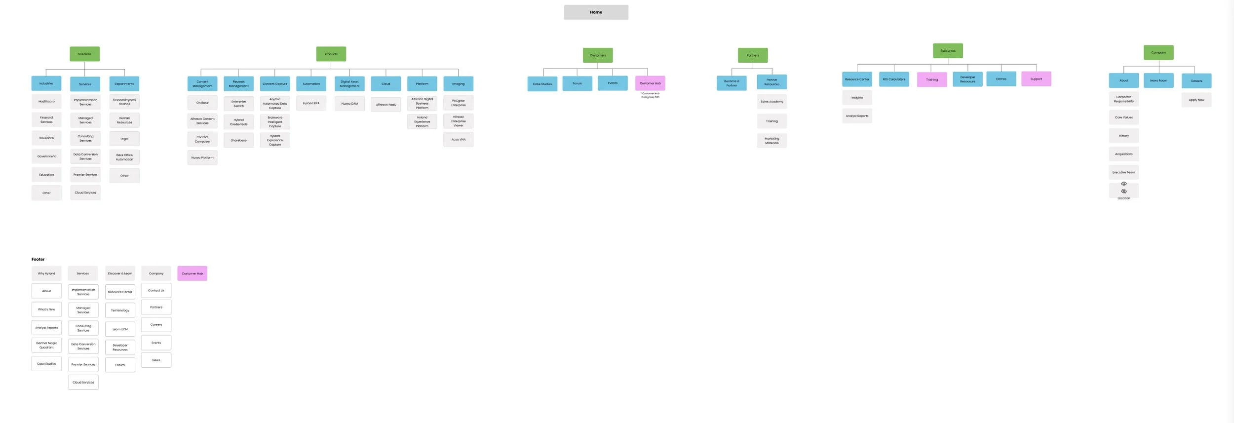
We condensed 1000s of pages of content into a few hundred, reducing the number of clicks and shortening the customer journey. The overly complicated information architecture was reduced to fewer categories and aligned with more common IA patterns, allowing users to find content quickly. Existing customers no longer needed to search through various resources to find what they needed. The new seamless experience across the .com and the customer hub allowed users to easily navigate between thought leadership content and unique product information and tools.
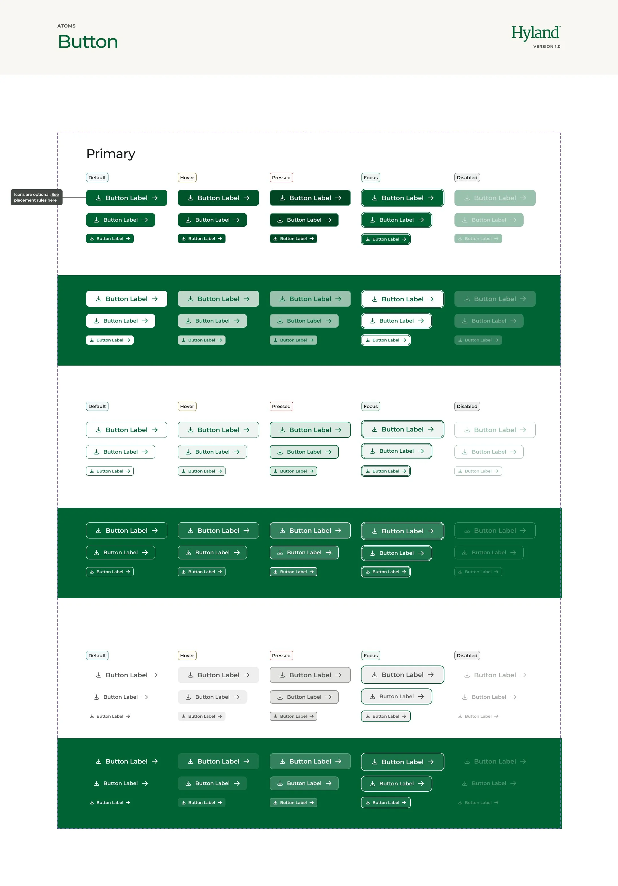
Additionally we created a consistent and optimal brand experience for the user, through the implementation of unified design system, which utilized design tokens.
CONTRIBUTIONS
Team leadership
Stakeholder management
UX + UI Design workshops
Wireframes
Information architecture
Design prototypes
Design system
Discovery
Our first step in tackling the issue was through discovery. We gathered as much information as we could through interviews, surveys, workshops to evaluate how potential buyers and existing customers use the Hyland ecosystem.
It became apparent that users were frustrated and stakeholders were unsure of how to categorize content. Stakeholders needed guidance in how to consolidate and categorize content that followed more common UX patterns which could be easily found. Through competitive analysis we evaluated patterns that emerged across the tech industry and utilized that data to frame our information architecture.
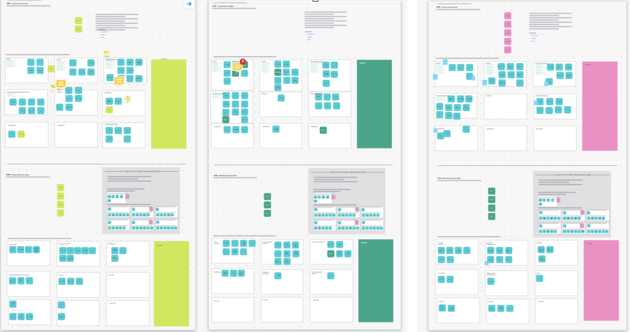
A card sorting workshop with stakeholders provided additional insights that influenced the restructured sitemap and user flows.
Wireframes
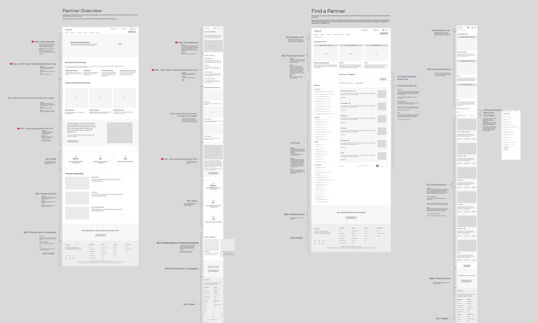
During the discovery phase, we gathered insights that helped us define a variety of user stories. We then prioritized the user stories based on a phased approach due to an extremely tight deadline for development. We broke the users stories down by business needs, tech level of effort and immediate access to all necessary content and defined which features would be a part of phase one. From there we jump into the wireframes.
Working with a new development partner and limited time, we had to ensure the wireframes and modules were annotated with an extreme level of detail.
User Testing
Throughout the design process we tested wireframes and interactive prototypes with multiple users. We continued to iterate and enhance the product based on prioritized user feedback. Additional user feedback, not determined as a priority for phase one, was added to the user story backlog for future releases.

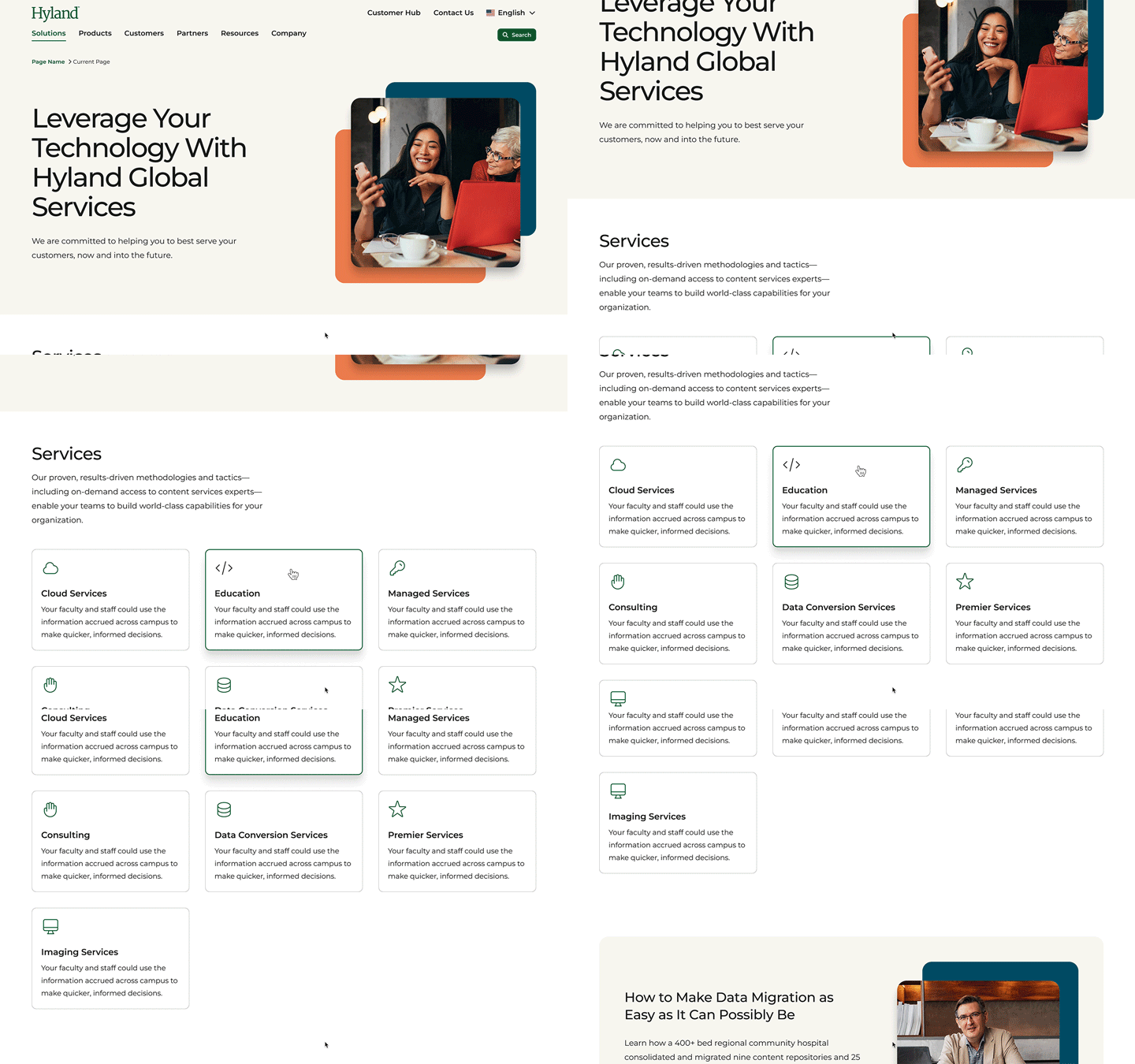
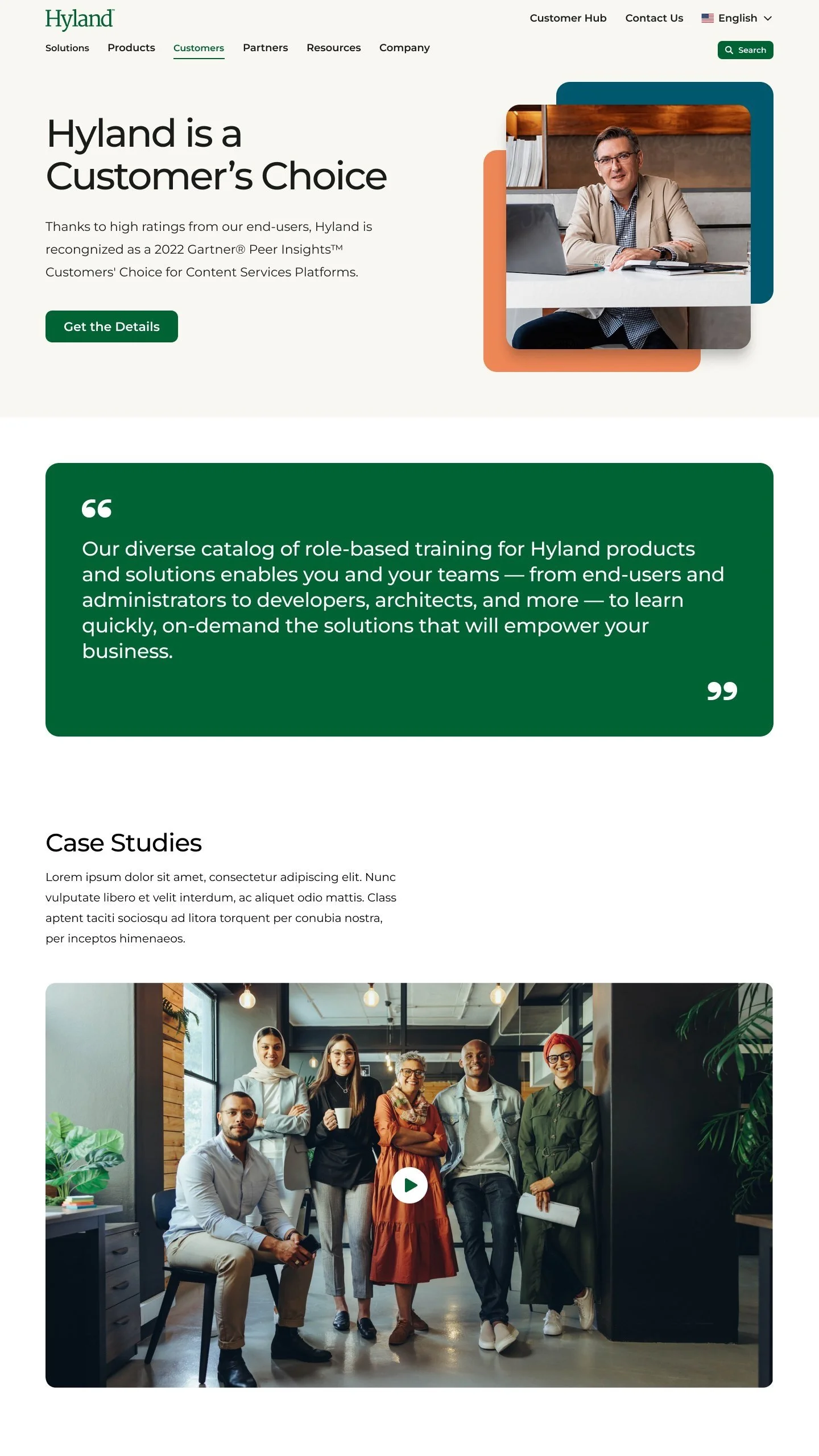
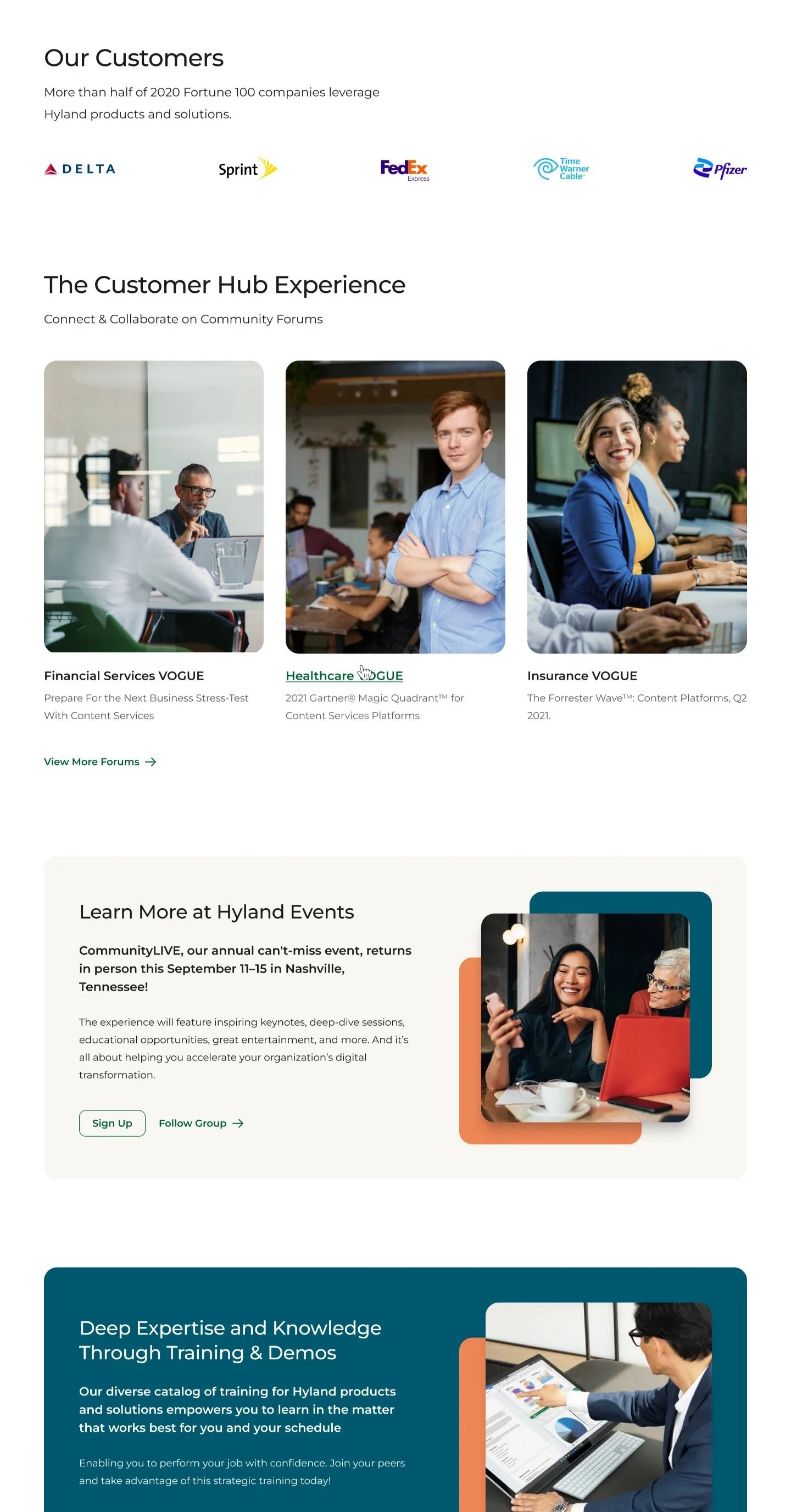
Hyland.com MVP
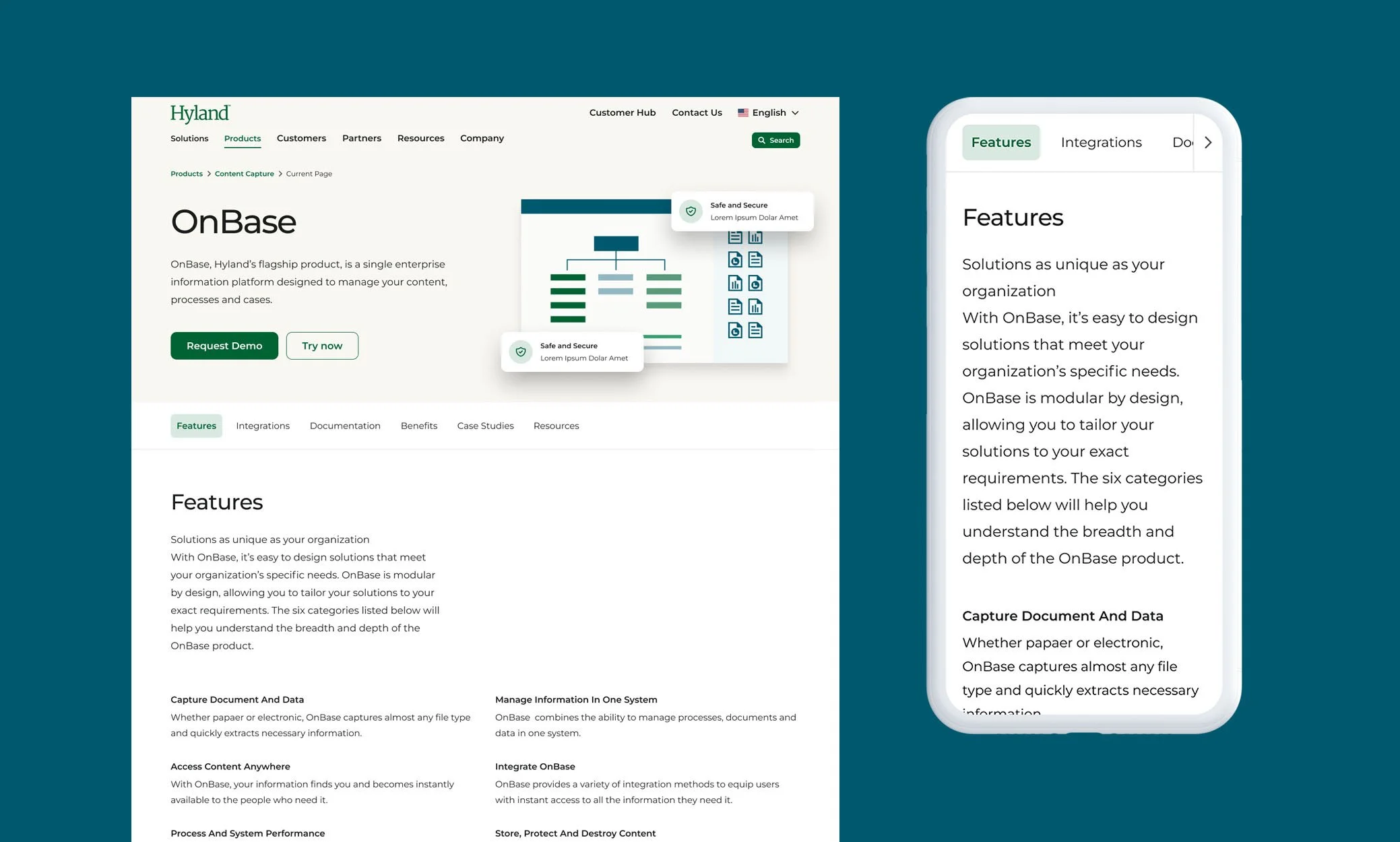

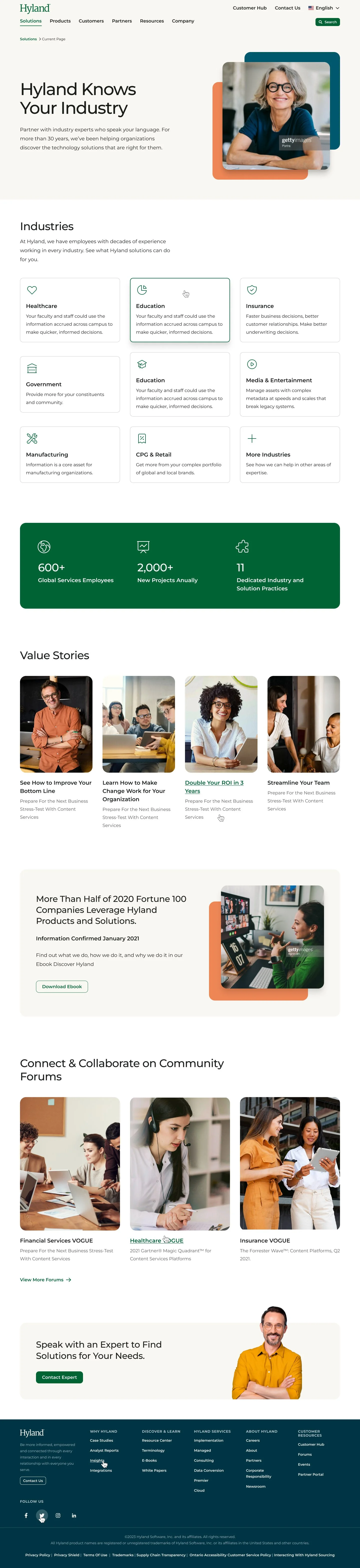
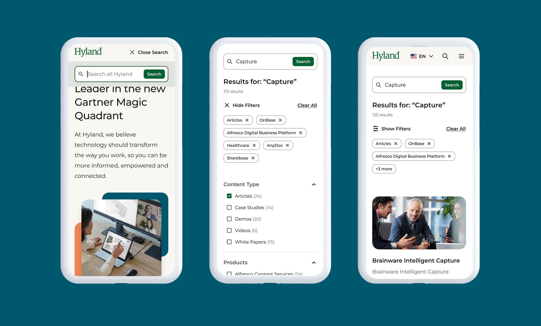
Design System
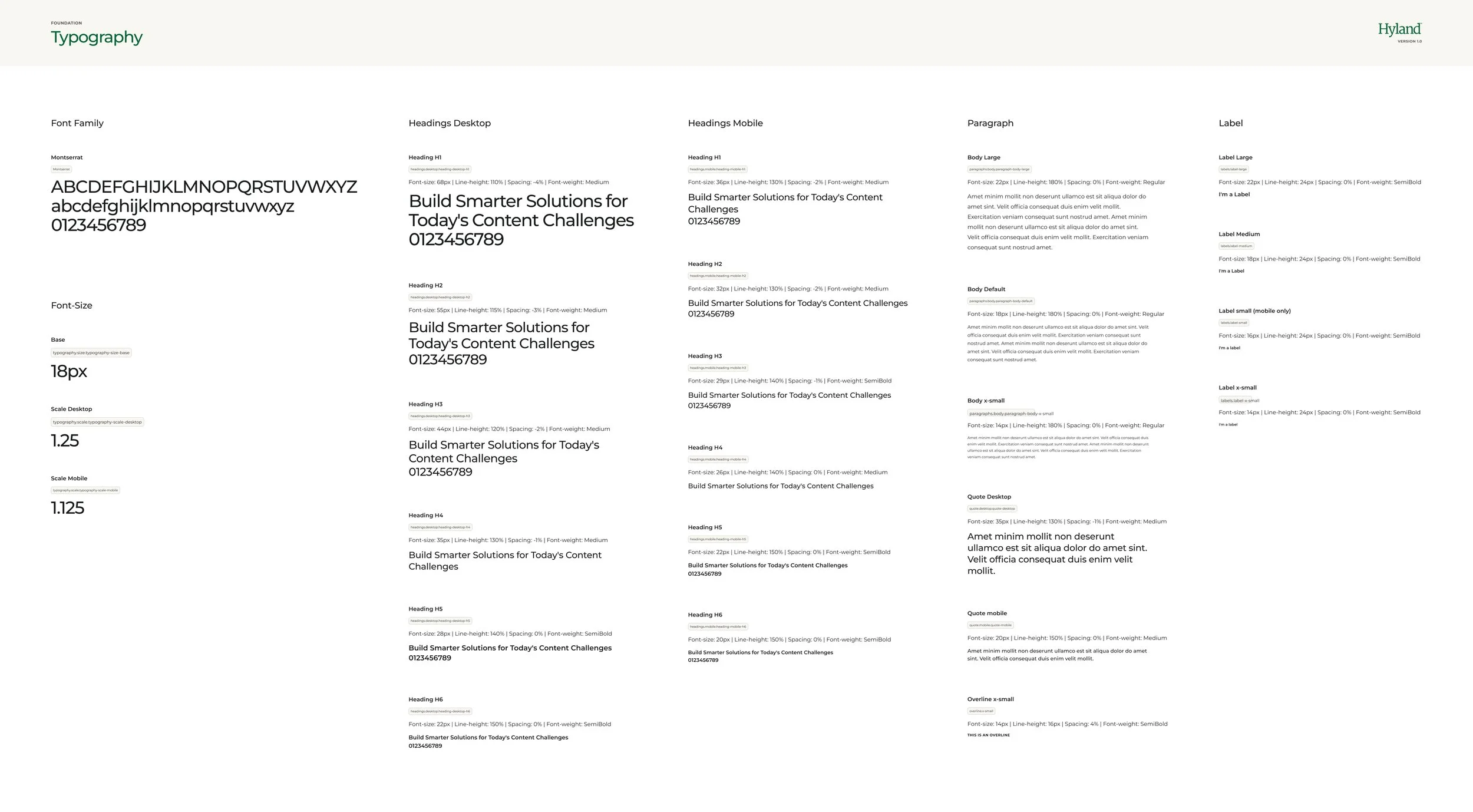
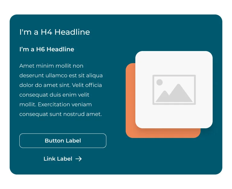
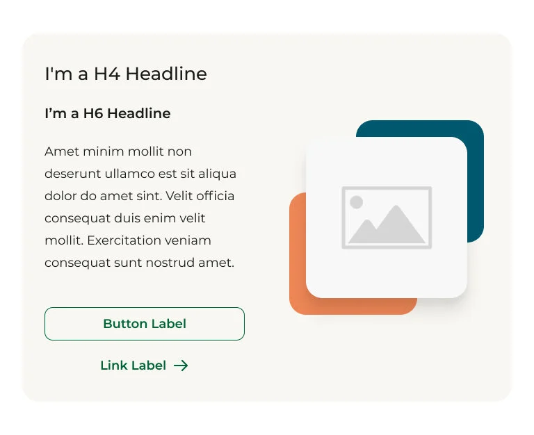
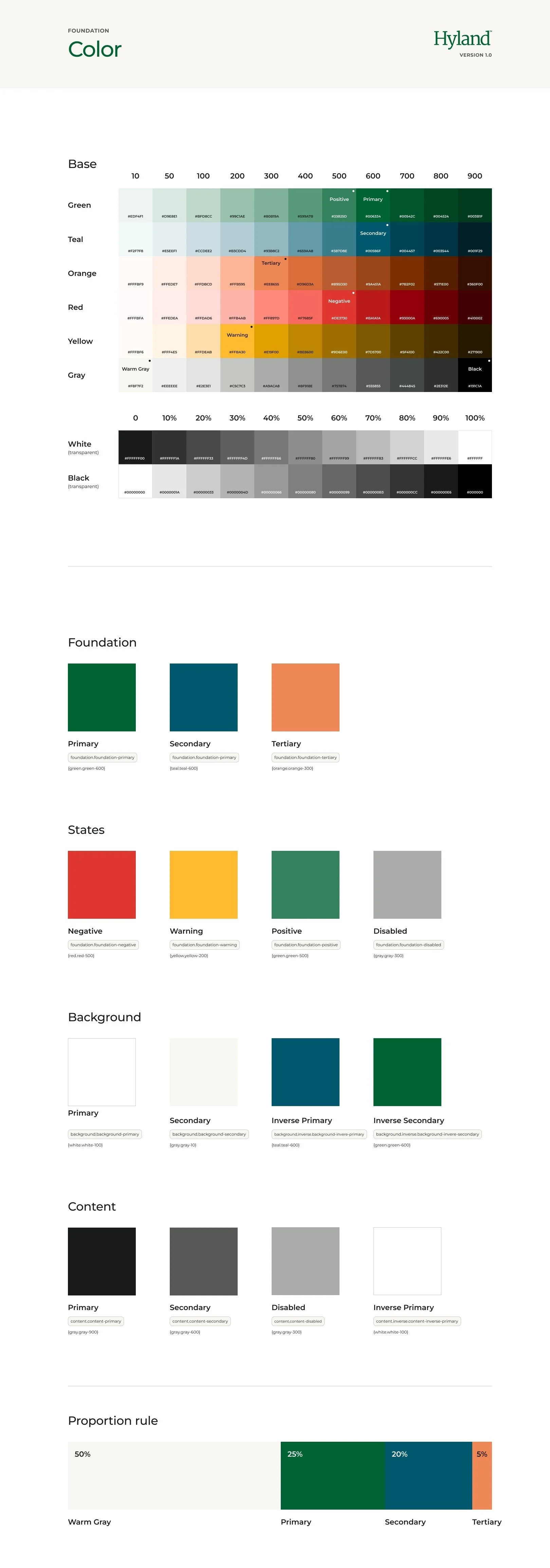
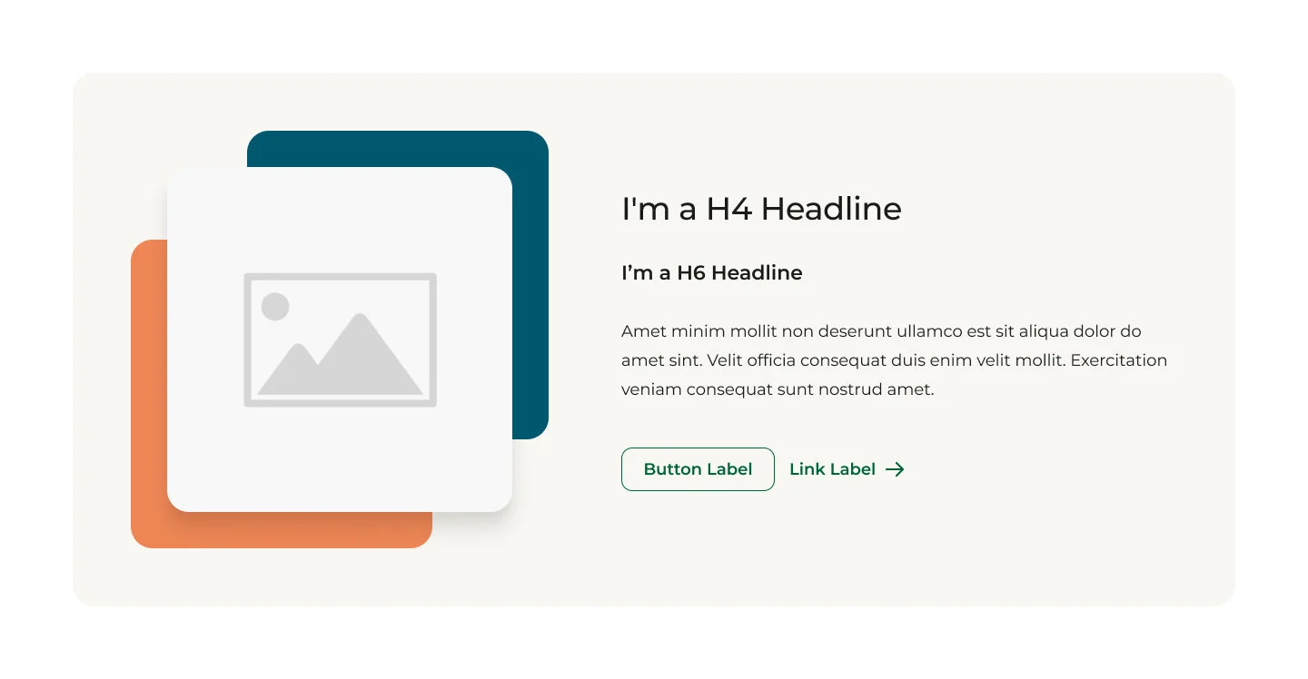
Hyland’s previous design system failed accessibility tests and was overly complicated, creating a fractured site experience. A unified design system was used across the entire ecosystem, .com and the customer hub, to create familiar UI patterns and reduce cognitive overload for users.
The newly implemented design system reduced engineering costs and time through the use of design tokens.